Personal color Sub-season
Bright Spring Personal Color Analysis
What the Bright Spring season is
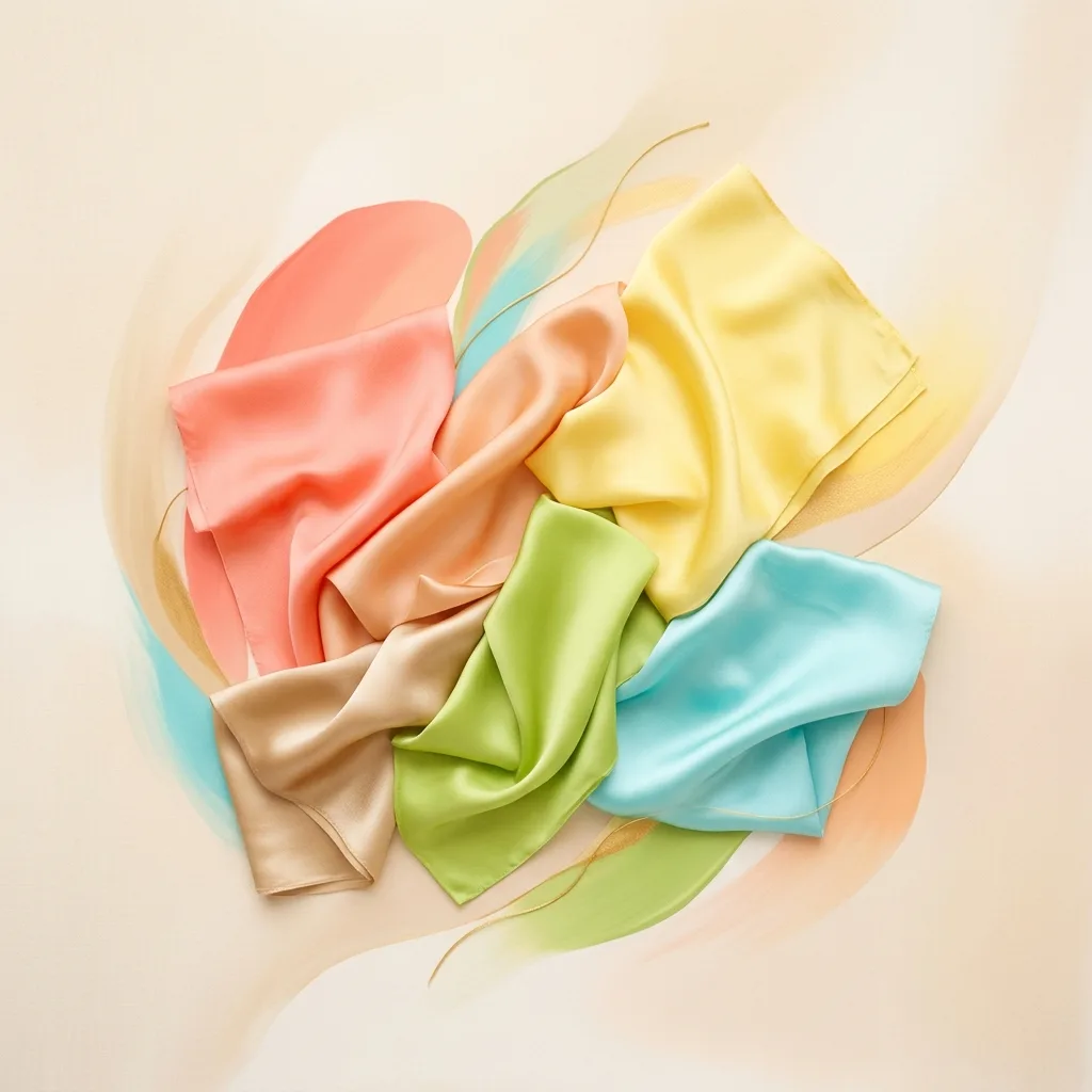
Bright Spring is the highest-contrast, most saturated variation of Spring, on the border with Winter. It keeps the warmth, but with vivid, bright colors.
It's the sub-season for those with higher contrast between skin, eyes and hair within the warm family, and looks amazing in intense, luminous colors.
Bright Spring is the most intense sub-season in the family: it has Spring's warmth, but with saturation and contrast that recall Winter. Clarity is what rules here. Luminous skin, eyes that seem to sparkle and hair that is often darker than other Springs' create a high-contrast face that needs vivid colors to stay balanced.
That changes the family rules quite a bit. Light Spring struggles with any dark shade and Warm Spring depends on lots of gold, but Bright Spring accepts deep colors and even a softened black, as long as everything is clean and crisp. Crimson, raspberry, ocean blue, sunshine yellow and teal share the same palette; the common thread isn't lightness, it's brightness.
Bright Spring's biggest enemy is hidden gray. Dusty, earthy and muted colors that look like they've been through a filter dull the natural contrast of the face and make you look tired even when the temperature is right.
How to know if Bright Spring is your season
- There's clear contrast between your skin, eyes and hair, even with a warm undertone.
- Your eyes are vivid and clear: aqua, turquoise, bright light blue or brown with a golden sparkle.
- Very bright colors don't steal attention from you in photos; they light up your face.
- Dusty tones like dusty rose, grayish beige and sage make you look worn out.
- Your natural hair is usually medium to dark brown with warm glints, or a rich golden blonde.
- Gold is your best metal, but polished silver doesn't wash you out completely.
- Ivory and bright navy look great on you; medium beige and khaki look flat.
Who it's for
Skin
Light to medium, warm undertone with luminosity.
Eyes
Vivid: green, turquoise-blue or bright brown.
Hair
Mid to dark brown with warm highlights.
Bright Spring color palette
Core colors
Neutrals for your wardrobe base
How to wear Bright Spring colors
Bright Spring neutrals are crisper than other Springs': bright navy, ivory, golden beige, warm light gray, coffee brown and even a softened black. They provide a clean contrast that lets the palette's electric colors shine without competition. Avoid in-between neutrals like grayish medium beige and flat khaki, which disappear next to your face.
This is the place to play with contrast: ocean blue with sunshine yellow, coral with turquoise, teal with watermelon pink, navy with crimson, ivory with raspberry. Color blocking, graphic prints, bold stripes and vibrant florals on a light or navy ground capture the spirit of this sub-season. What doesn't work: faded prints, vintage-wash effects, tie-dye in washed-out tones and any monochrome look in medium, muted shades.
At work, a bright navy suit with an ivory shirt and a coral top or scarf conveys authority without dimming your light. For weekends, the palette suggests the simplest option: a coral T-shirt or sweater with your favorite jeans. In the evening, go for saturated colors and shiny fabrics, like raspberry satin, a turquoise dress or gold sequins, or a softened black with big gold jewelry and a bright lip.
Bright Spring makeup
Bright Spring makeup can, and should, have a bold point of color. Foundation has a warm, yellow-golden or peach undertone with a luminous or satin finish; very matte, flat finishes take away your natural glow. For blush, rosy peach and bright coral with a hint of golden shimmer bring instant vitality.
On the lips, vivid coral, watermelon pink, orange-red, crimson and hot pink are spot-on, in creamy or glossy finishes. For eyes, besides light gold, peach and bronze, Bright Spring can play with turquoise, parakeet green and violet, as shadow or colored liner. Black mascara and a well-defined liner work, because your face can handle contrast. Avoid grayish shadows, muddy browns and flat nudes, which leave your eyes looking lifeless.
Lipstick shades
Blush shades
Eyeshadow shades
Best hair colors for Bright Spring
Bright Spring hair needs warm shine and enough depth to keep the contrast. Medium to dark golden brown, chocolate with honey glints, rich golden blonde and strawberry blonde are the best bases. Honey, caramel or golden highlights add movement without flattening the contrast. Avoid very light and ashy blondes, which lower the contrast and cool your skin, and dull, flat browns, which make your face look tired. If your natural hair is dark, don't lighten it too much: keep the root deep and build shine with a gloss treatment or warm glints.
Hair shades that harmonize
Bright Spring accessories and metals
Bright yellow gold is the most flattering metal for Bright Spring, and rose gold works beautifully too. Being on the border with Winter, this is the Spring that tolerates silver best, and even polished gunmetal, as long as the finish is shiny. Jewelry with vivid stones like turquoise, coral, light emerald, ruby, peridot and blue topaz, as well as colorful acrylic pieces, shares the palette's energy. For glasses, crisp frames in contrasting tortoiseshell, gold, navy, red or coral frame the face better than muted shades.
Metal and accessory tones
Colors that flatter
The most vivid colors of the Spring palette: intense coral, bright turquoise, lime green and vibrant yellow. Brightness is your friend.
Colors to avoid
Cool, heavy tones like pure black, charcoal gray, dark burgundy and intense navy, which dim the skin's natural glow.
Why these colors don't flatter Bright Spring coloring
Bright Spring's avoid colors aren't too dark or too cool; they're muted. Muted cocoa brown, smoky khaki, opaque terracotta, burnt wine, dusty blue-gray and dusty beige all share a layer of gray that kills clarity. Next to a high-contrast face, these colors lose the battle: the face looks flat, the eyes lose their sparkle and the skin looks tired. If you love the elegance of a grayed tone, wear it as tailored pants and bring coral or sunshine yellow up to your face.
Bright Spring or Bright Winter?
Bright Spring and Bright Winter share the same dominant trait, intensity, which is why they're neighbors in the 12-season system. Both wear vivid colors, both handle contrast and both fade in dusty tones. The difference is temperature: Bright Spring wears warm brights like coral, sunshine yellow, turquoise, apple green and watermelon pink, while Bright Winter wears cool brights like fuchsia, royal blue, emerald, icy pink and optic white.
The most telling tests are ivory versus optic white and coral versus fuchsia. If ivory and coral make your skin look even and flushed while optic white looks harsh, you lean Bright Spring. If optic white and fuchsia make your face look sharper and coral gives you a yellowish cast, you lean Bright Winter. Black is another clue: Bright Winter looks great in pure black near the face, while Bright Spring prefers a softened black, a bright navy or coffee brown, always paired with color.
Read the full Bright Winter guideBright Spring: frequently asked questions
Can Bright Spring wear black?
Yes, and it's the Spring that gets along with black best. Even so, a softened black, a bright navy or coffee brown tend to be more harmonious than jet black. When you wear black near your face, pair it with a bright lip, gold jewelry or a coral or turquoise piece to keep the warmth.
What hair color is best for Bright Spring?
Golden brown, warm chocolate with honey glints, rich golden blonde and strawberry blonde. The key is keeping enough shine and depth to preserve the contrast with your skin and eyes. Ashy blondes and dull, flat hair are what wash you out the most.
Can Bright Spring wear silver?
Yes. Being close to Bright Winter, it's the Spring most tolerant of silver, especially in polished, shiny pieces. Still, yellow gold brings more vitality and light to your face and remains the first choice.
Can Bright Spring wear beige?
It depends on the beige. Light, crisp neutrals like ivory and golden beige work well. Medium, dusty beiges with a grayish base are on the avoid list, because they flatten the contrast in your face. If you wear beige, add a vivid color near your face.
Bright Spring vs Warm Spring: how do I tell them apart?
Both are warm, but the dominant trait is different. Warm Spring depends on gold, has medium contrast and looks great in camel and caramel. Bright Spring depends on intensity, has high contrast and needs vivid, crisp colors, losing its glow in earthy or overly muted tones.
Keep reading
June 16, 2026
Personal color analysis types: Winter, Autumn, Spring or Summer, which are you?
Learn the 4 color seasons of personal color analysis, what defines each palette, how undertone and contrast work, and discover yours with a free AI color test.
Read more
June 18, 2026
Best hair color: what really suits your personal color season
Find the best hair color for your personal color season. A season-by-season guide to blondes, browns, reds, highlights and balayage that flatter your undertone.
Read more
June 16, 2026
Makeup and personal color analysis: how to choose the shades that flatter you most
Learn how to use your color season to pick lipstick, eyeshadow, blush and foundation more accurately. A complete guide for Spring, Summer, Autumn and Winter.
Read moreCould you be a Bright Spring?
Discover your personal color season in under 2 minutes with our AI analyzer. Free and no sign-up.