Personal color Sub-season
Bright Winter Personal Color Analysis
What the Bright Winter season is
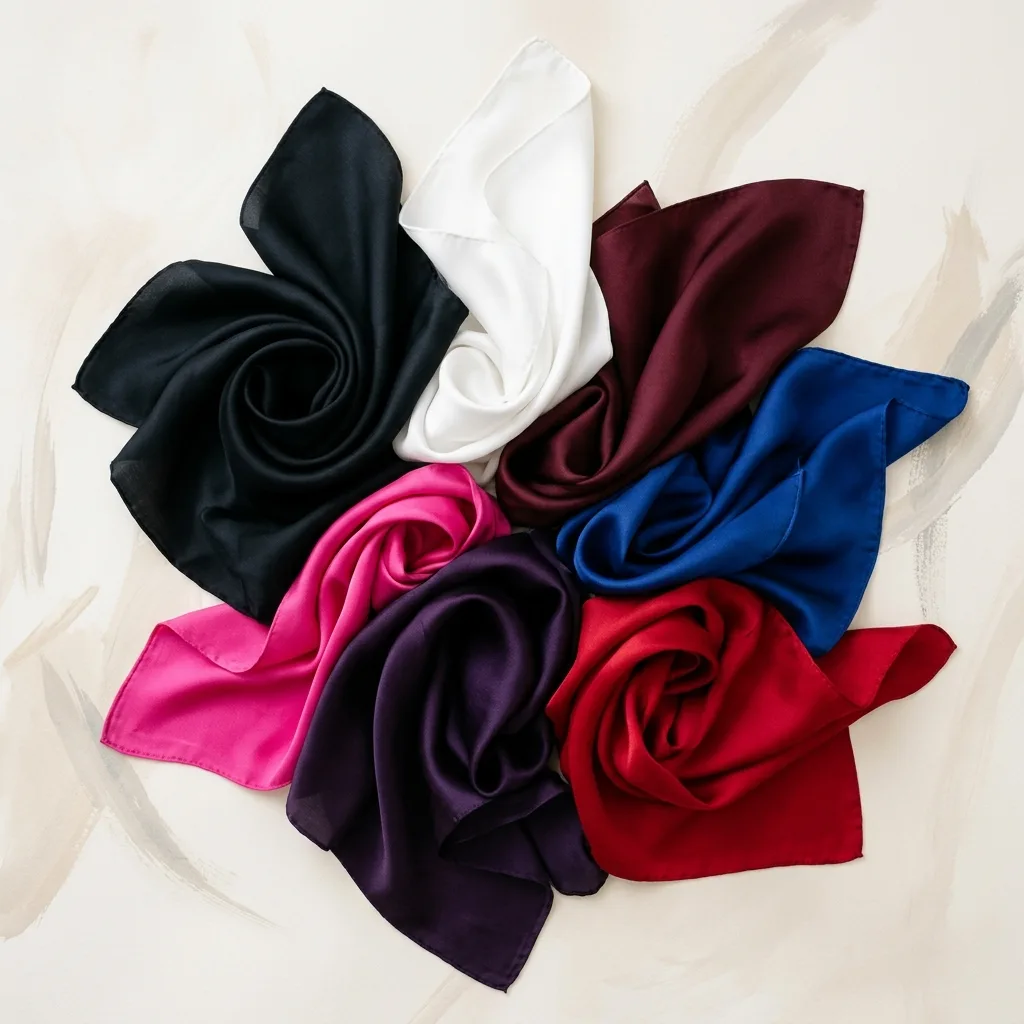
Bright Winter is the highest-contrast, most saturated variation of Winter, on the border with Bright Spring. The colors are vivid, pure and luminous.
It's the sub-season for those with the most striking contrast of all, flattered by intense, bright colors like shocking pink, royal blue and pure red over snow white.
Bright Winter is the sub-season where clarity rules. The temperature is cool and the contrast is the highest in all of personal color analysis, but the trait that truly defines this palette is saturation: pure, vivid, luminous colors with no gray or earth mixed in. It's a beauty that recalls the northern lights: magnetic, full of energy and impossible to ignore.
Sitting on the border with Bright Spring, Bright Winter has a touch of neutrality borrowed from its neighbor. That opens the door to colors the other Winters wear less easily: vibrant lemon yellow, emerald green, cobalt blue, sky blue and shocking pink, plus icy tones like light mint. Depth is light to medium, so the palette jumps between very dark and very light colors, and that leap is exactly what makes the face glow.
Bright Winters usually have eyes that stand out for their clarity (vivid blue, cool green or intense brown with a crisp iris) and a striking difference between skin, hair and the whites of the eyes. Skin can be fair, medium or cool olive, but it always has a luminosity of its own that muted colors can't keep up with.
How to know if Bright Winter is your season
- Your eyes seem to sparkle, with a strongly colored iris and a defined outer ring.
- There's strong contrast between your dark hair and fair or medium skin, or between your eyes and the rest of your face.
- Muted, dusty colors like beige, taupe and khaki make you look tired.
- Shocking pink, cobalt blue and emerald green look natural on you, not over the top.
- Black with pure white is one of the combinations that gets you the most compliments.
- Polished silver looks great, and a light, shiny gold also works as an accent.
- A vivid lipstick brightens your face more than a flat nude does.
Who it's for
Skin
Light to medium, cool undertone with luminosity.
Eyes
Vivid: bright blue, cool green or intense brown.
Hair
Black or dark brown, high contrast with the skin.
Bright Winter color palette
Core colors
Neutrals for your wardrobe base
How to wear Bright Winter colors
Bright Winter neutrals are just as striking as its vivid colors: absolute black, pure white, charcoal gray and deep navy. Think of them as the frame of a work of art. They're there to let color shine, not to compete with it. Avoid building your wardrobe around beige and khaki, which steal the very contrast that defines this sub-season.
Here's a foolproof formula for indecisive days: one simple piece in a vivid color, like a hot pink knit, with well-cut black trousers. The logic works across the whole wardrobe, with one star color and one strong neutral. High-contrast pairings like black and white, navy and pink, white and cobalt, black and lemon yellow or charcoal and emerald are the most flattering. Color blocking, with two vivid colors side by side, is also natural territory for a Bright Winter.
At work, swap corporate beige for navy and charcoal with a crisp white shirt and a pop of royal blue or magenta. In the evening, this sub-season literally shines: silver metallics, sequins, satin and vinyl in black, pink, cobalt or vivid purple. For prints, choose graphic designs in pure colors on a white or black background, such as wide stripes, geometrics or pop florals. The palette's icy shades, like light mint, sky blue and bubblegum pink, work best next to a dark neutral that keeps the contrast up.
Bright Winter makeup
Bright Winter lips were made for vibrant colors: hot pink, fuchsia, magenta and raspberry red are the top choices, and a pure, vivid red rounds out the list. Creamy or glossy finishes enhance the sub-season's natural luminosity. For blush, cherry pink and bright pink mimic the flush of a cold day. The rule is to apply it lightly so it balances your eyes and lips instead of competing with them.
For eyes, graphite, charcoal and silver build a defined base; for color, plum, vibrant pink and a shimmery navy bring out the sparkle of your irises. Graphic liner in black, or even cobalt, suits this sub-season. Choose a foundation with a cool to neutral-cool undertone and a luminous finish, since very matte, flat formulas dull the radiance that is Bright Winter's trademark. A touch of silver or pearl highlighter completes the skin.
Lipstick shades
Blush shades
Eyeshadow shades
Best hair colors for Bright Winter
Bright Winter hair should keep a cool base and high contrast. Blue-black and ash dark brown are the surest choices, and fair-skinned Bright Winters can also wear pure platinum for a striking frame. Red, copper or golden highlights clash with the cool undertone, and flat medium shades, like a dull mid brown, lower your contrast. Shine matters as well: dull hair dims the luminosity that is this sub-season's signature.
Hair shades that harmonize
Bright Winter accessories and metals
Bright Winter accessories should reflect light. Silver, white gold and platinum in polished, high-shine finishes are the best choices; matte and aged finishes work less well here than for Dark Winter. A light, very shiny gold can also come in as an intentional contrast point. Crystals, cubic zirconia, sapphires, emeralds and rubies, or brightly colored resin pieces, match the palette's energy. For glasses, black, clear, hot pink, cobalt or cool red frames look modern and in proportion with the face.
Metal and accessory tones
Colors that flatter
The most vivid, cool Winter colors: shocking pink, royal blue, pure red, emerald and snow white. Brightness and contrast are your friends.
Colors to avoid
Warm, muted tones like beige, caramel, mid-brown and earthy shades, which neutralize the natural contrast.
Why these colors don't flatter Bright Winter coloring
Bright Winter calls for pure, vibrant, intense colors, so the ones that hold it back are warm, earthy and muted: cocoa brown, grayish beige, dusty taupe, sepia rose, soft bronze and taupe gray, along with mustard and olive green. These shades muddy your coloring: your natural contrast drops, the sparkle in your eyes disappears and you end up looking worn out. Because this sub-season thrives on clarity, even a cool color goes wrong if it's too grayed. If you love one of these shades, keep it away from your face and brighten the look with a strong neutral or a vivid color from your palette near your neck.
Bright Winter or Bright Spring?
Bright Winter and Bright Spring are the two most saturated sub-seasons in personal color analysis. Both have high contrast and luminous eyes, and both go flat in muted colors, so much so that their colors to avoid are nearly identical: dusty browns, taupes, khakis and beiges. What separates them is temperature. Bright Spring is warm: vivid coral, orange-red, turquoise, lime green, golden yellow and yellow gold. Bright Winter is cool: shocking pink, fuchsia, cobalt blue, emerald, lemon yellow and silver.
The simplest test is to compare shocking pink with a vibrant coral, and pure white with ivory. On a Bright Winter, pink and pure white leave the skin clean while coral casts an orange tint; on a Bright Spring, coral lights up the face and pink looks too cold. Hair offers clues too: Bright Winters look best in blue-black and ash dark brown, while Bright Springs call for golden brown and honey highlights.
Read the full Bright Spring guideBright Winter: frequently asked questions
Can a Bright Winter wear beige?
Classic beige isn't recommended: it's muted and warm, and it erases the contrast that defines this sub-season. For a light neutral, choose pure white or light gray. If you do wear beige, keep it away from your face and pair it with black or a vivid color from your palette.
What hair color is best for a Bright Winter?
Blue-black and ash dark brown are the surest choices. With fair skin, pure platinum also works. Avoid coppery, red and golden highlights, and keep your hair glossy.
Can Bright Winters wear gold?
Yes, selectively. Polished silver comes first, but a light, very shiny gold works as an intentional contrast point. Antique gold and bronze are too muted to keep up with this sub-season.
Can a Bright Winter wear pastels?
Dusty pastels, no. But your palette includes clear, icy light shades (light mint, sky blue, bubblegum pink and pale lemon) that work when they're clean and sit next to a dark neutral like black or navy to keep the contrast.
What lipstick colors suit a Bright Winter?
Hot pink, fuchsia, magenta, raspberry red and pure red. Creamy or glossy finishes flatter you even more. Very flat or beige nudes leave the face looking lifeless.
Keep reading
June 16, 2026
Personal color analysis types: Winter, Autumn, Spring or Summer, which are you?
Learn the 4 color seasons of personal color analysis, what defines each palette, how undertone and contrast work, and discover yours with a free AI color test.
Read more
June 16, 2026
Makeup and personal color analysis: how to choose the shades that flatter you most
Learn how to use your color season to pick lipstick, eyeshadow, blush and foundation more accurately. A complete guide for Spring, Summer, Autumn and Winter.
Read more
June 18, 2026
Best hair color: what really suits your personal color season
Find the best hair color for your personal color season. A season-by-season guide to blondes, browns, reds, highlights and balayage that flatter your undertone.
Read moreCould you be a Bright Winter?
Discover your personal color season in under 2 minutes with our AI analyzer. Free and no sign-up.